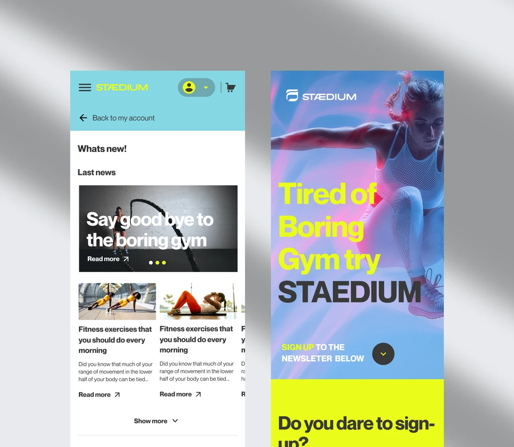
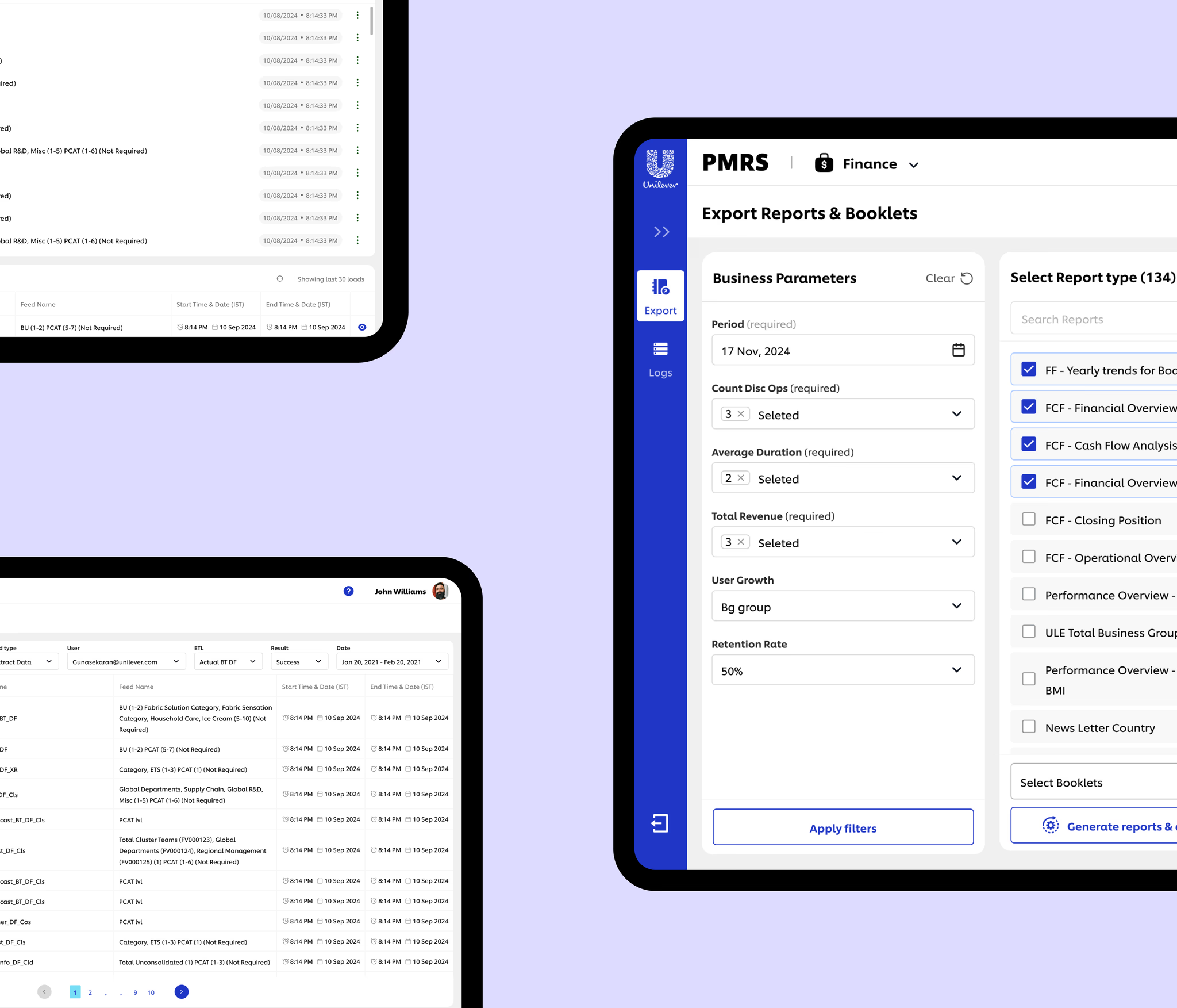
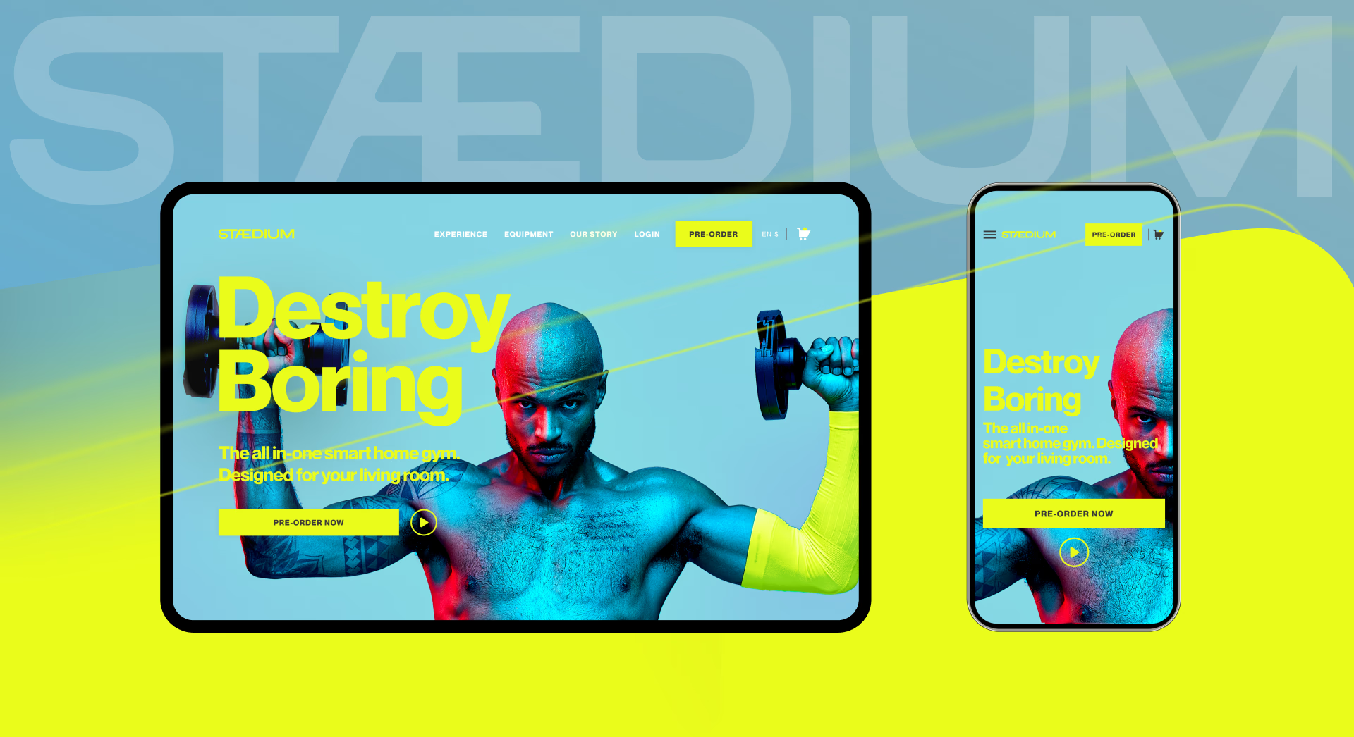
User experience, competitive research, information architecture, concepts, interaction design, visual design, style guides
GunaDeveloperProject ManagerMarketing
Outcome & impact
500+Pre-orders before launch
€500KIn pre-launch revenue
+70%Conversion rate vs. benchmark
TLDR
Got just a minute?
It's early 2021. Someone in Munich watches a video of a home gym that doesn't exist yet. €1,750 upfront, plus a monthly subscription. There's no showroom to walk into, no review to read, no friend who owns one, no returns policy that means anything because there's nothing to return. To buy it, they have to pay first and see it four months later.
When the brief came in, it read like a standard ecommerce build: homepage, product page, checkout. But there was no product to sell yet, no store data to learn from, and no site to test, because the site was the thing we were making. The real job was never selling. It was manufacturing enough confidence that a stranger would commit money to a category they'd never bought from, on a promise.
Problem
A pre-launch, high-consideration product with no ecommerce presence and no website-level user data. It had to explain an unfamiliar system, build trust without proof, and convert before the product existed.
My role
Owned end-to-end design across desktop and mobile. Ran the competitive analysis that stood in for user research, defined the IA and product narrative, made the pricing-model call, and shipped the high-fidelity UI and style guide with product, engineering and marketing.
Context
What was it about?
What is the project about?
A complete 0→1 pre-launch initiative, built on Shopify, with a fixed launch date and a Germany-first, pan-European audience. Establishing the platform early means the constraint doesn't arrive as a late excuse.
What is STÆDIUM?
Built by Freeletics, Stædium is an all-in-one smart home gym that blends physical strength training with digital coaching, game-like scoring, and live community competition.
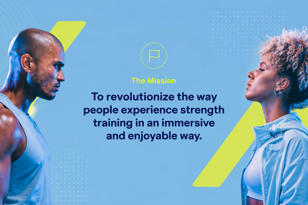
The missionGuna
The challenge
Every signal a buyer normally uses to decide, this product didn't have
Stædium was a new category entry from a brand nobody associated with hardware, priced at €1,750, four months before anything could ship.
Issue 01Nothing to verify
No showroom, no owner to ask, no review to read, and a returns policy that meant nothing because there was nothing yet to return.
Issue 02Limited category familiarity
Few buyers had ever purchased a connected home gym. There was no established buying pattern to design against and no expectations to meet.
Issue 03No baseline to learn from
The ecommerce platform didn't exist, so there was no funnel, no behaviour, and no earlier version to improve on.
The confidence gapWhat buyers normally lean on, versus what Stædium could offer
Normal high-consideration purchasesix signals before money changes hands
1Explore
2See it
3Read reviews
4Ask an owner
5Compare
6Buy
Stædium at pre-launchtwo signals, and neither of them is proofSame journey, four slots empty
1See a website
–No physical product
–No reviews or social proof
–No category familiarity
–No site data to learn from
2Buy
Four missing signals: the gap the design had to carry.€1,750 upfront, four months before delivery, with nothing to touch and nobody to ask.
Research
We couldn't study users, so we studied the category.
Competitor analysis
What
Full competitive teardown of 5 direct competitors.
Brands
Source
Publicly available site content, and full purchase journeys walked end to end.
Looked at
Value communication, trust signals, navigation, education patterns, checkout friction.
Goal
Identify how successful products in this category reduce uncertainty and convert.
Competitor teardown: product focus, UX strengths, UX weaknesses and notable features for each brand. Dots under each brand show its UX score out of 5.
Gated content, complex value props before trust, navigation that breaks momentum.
Insights · What we learned from the category
What the teardown pointed back to
Insights
What separated the brands that convert from the ones that stall?
GunaNobody wins this category on specifications. They win it on story, and they lose it on friction.
Storytelling drives confidence
Trust is embedded, not isolated
Conversion improves when pressure drops
Emotion over specs
The shift
What changed after the teardown
What we assumed beforeSell the product
What the category showedBuild a confidence-driven experience
Hypothesis
If Stædium adopts the strongest communication patterns from category leaders while removing their friction points, users will feel confident enough to commit, even without prior product exposure.
The goal
Experience principles
Story-first experience
Focus 01
principle-story
Build an emotional narrative of transformation, strength, and community. Products come second.
Guna
Trust through people
Focus 02
principle-people
Showcase real users, ambassadors, and Freeletics' brand credentials to reduce perceived risk and humanise the brand.
Guna
Bold + consistent
Focus 03
principle-bold
A dark, cinematic, high-contrast system that makes a new brand read as an established one.
Guna
Conversion through clarity
Focus 04
principle-clarity
Every step from homepage to checkout optimised to feel smooth, obvious, and unhurried.
Guna
Information architecture
Turning competitive insight into a product narrative
The first execution step was a sitemap that converted the insights into a content sequence: what someone needs to feel at each stage before they're ready for the next one. Every page had a defined job, a business goal it served, and a place in the belief arc, not just a slot in a menu.
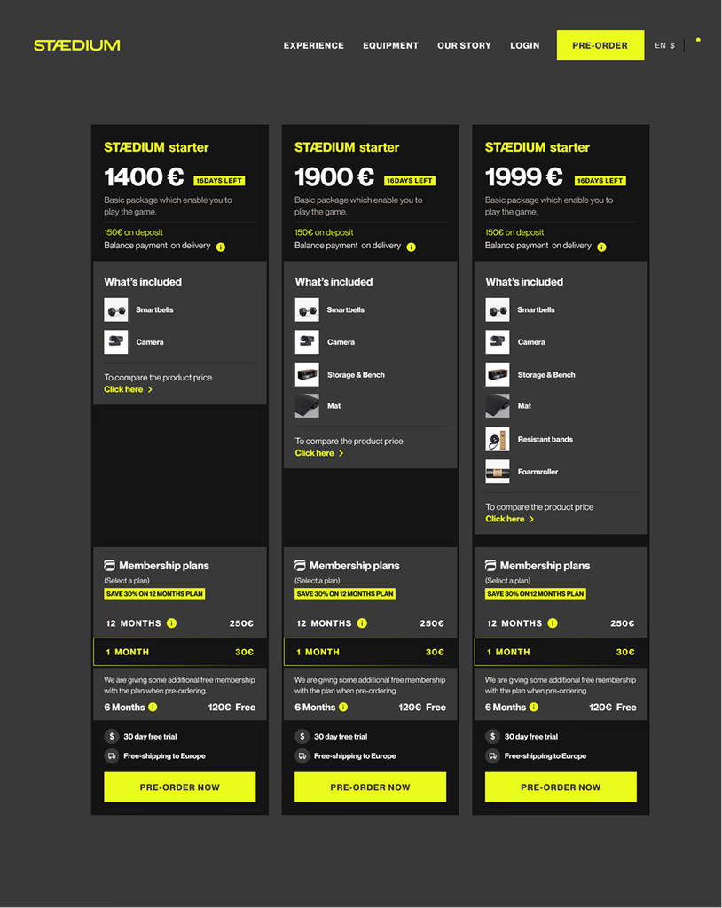
Removed multiple bundles to reduce decision fatigue
The plan
The business wanted multiple bundles: different packages for different training needs, add-ons, and tier flexibility. The standard ecommerce play for lifting average order value.
What changed?
Walking the flow with a pre-launch mindset, the bundle screen stopped looking like flexibility and started looking like homework. Users were still working out what Stædium was. We were handing them a configuration task on top of that.
BeforeAfter
The call
Ship a single bundle. One clear, confident bundle recommendation. No configuration required.
The insight
GunaBundle choice created more friction than value, specifically because this was pre-launch.
Pushbacks & alignment
Aligning stakeholders around evidence
What the marketing team wanted
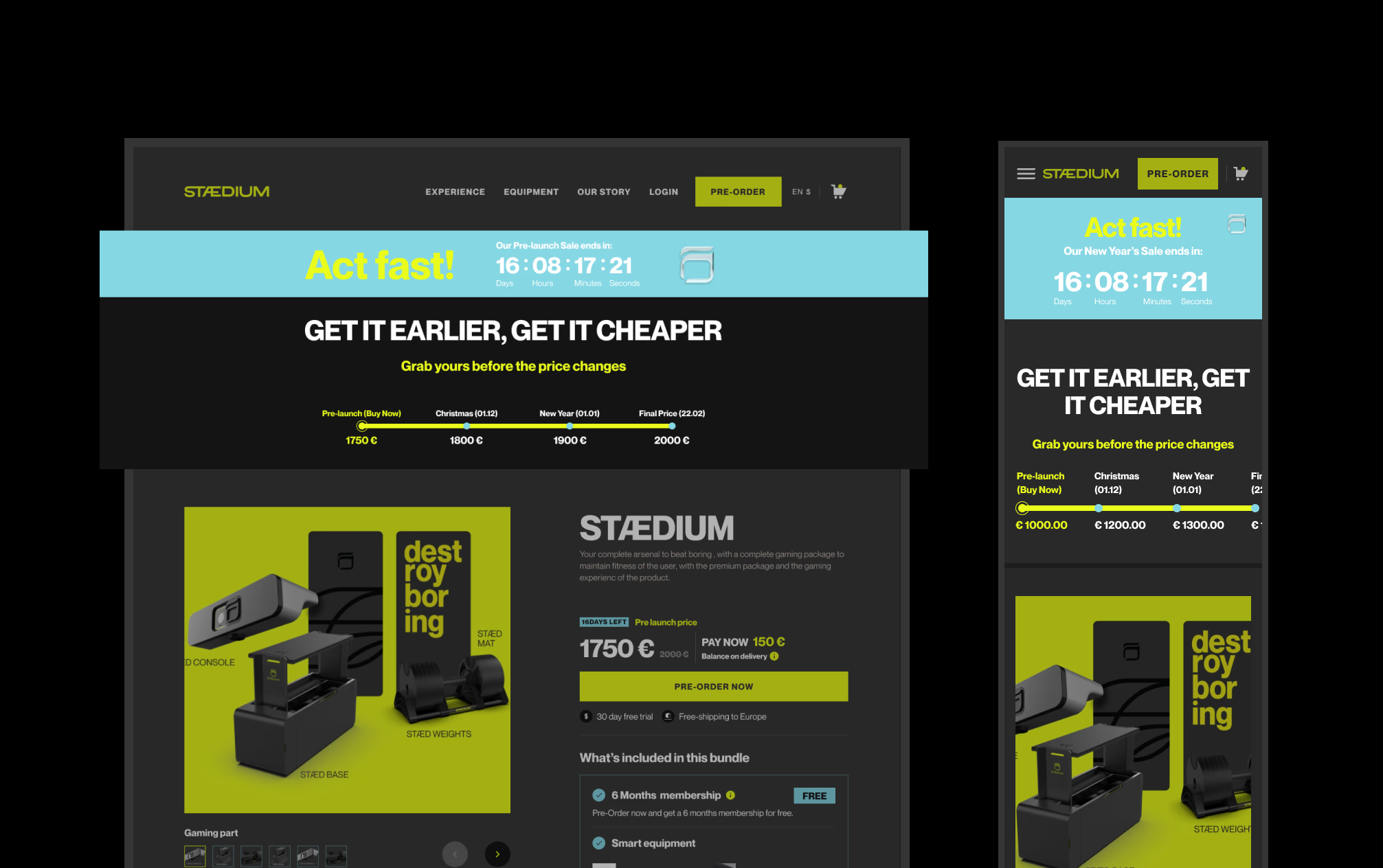
More promotional urgency.
Proposed
Countdown banners and discount messaging.
UX response
The objective wasn't to make people buy faster. It was to make them feel confident enough to buy at all.
The call
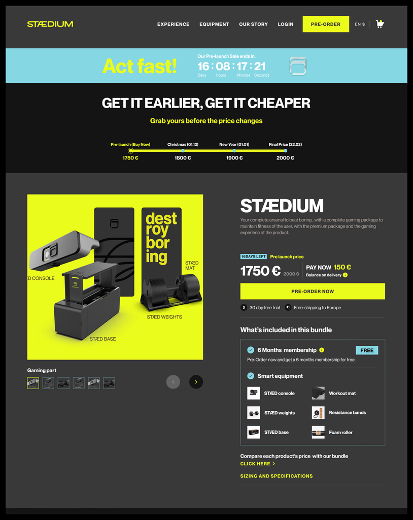
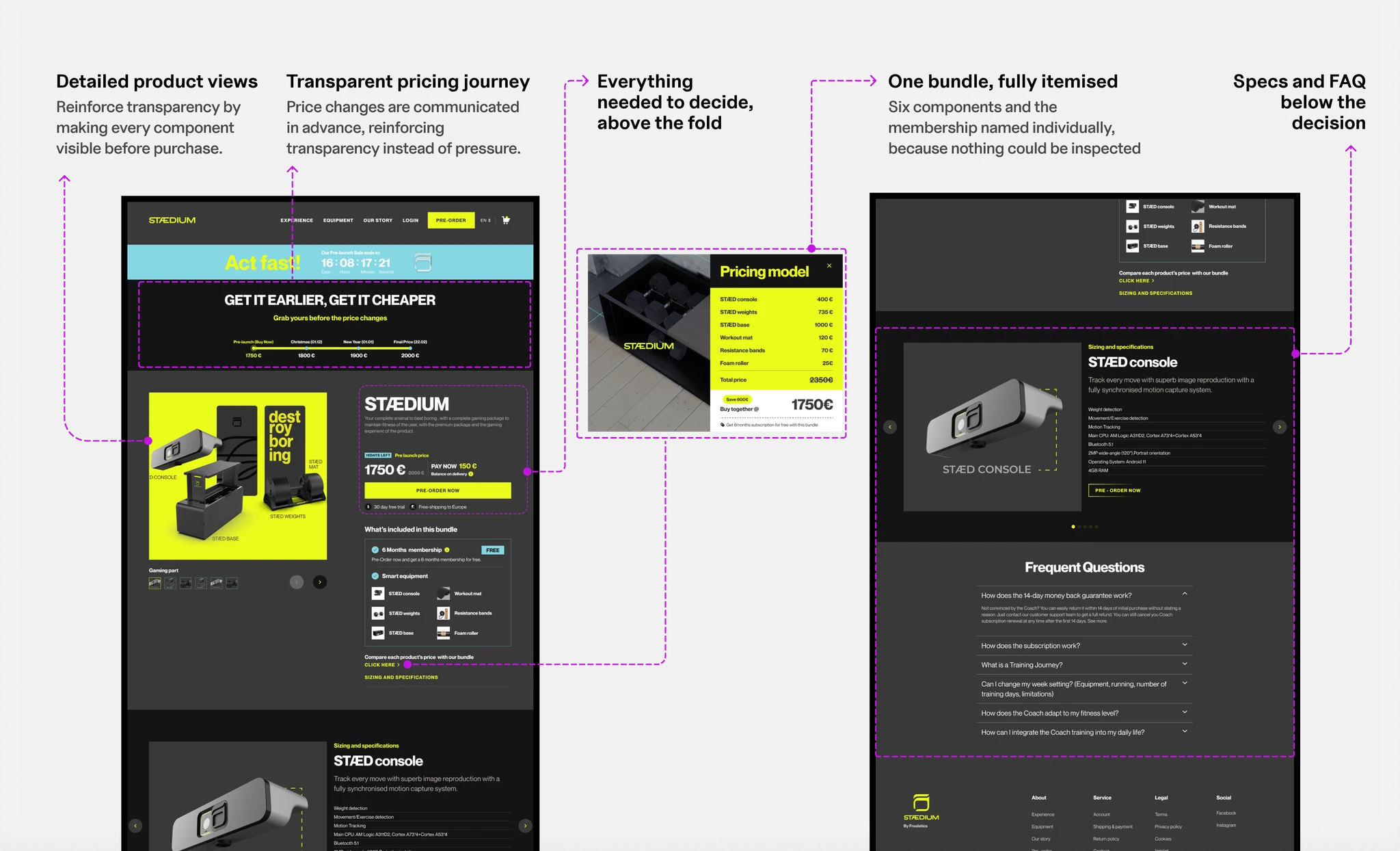
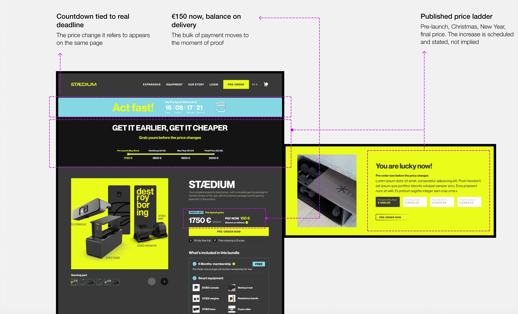
A countdown banner plus a transparent pricing roadmap instead.
Pre-order
Solution
The new experience
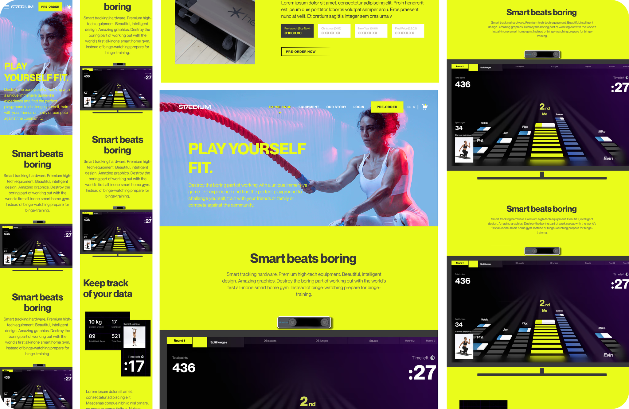
01Arrive
01 · Arrive
Insight
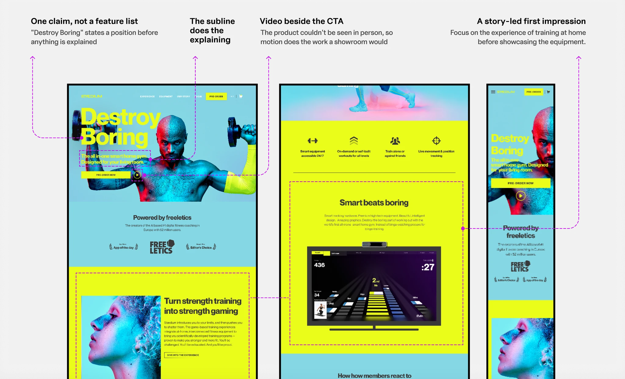
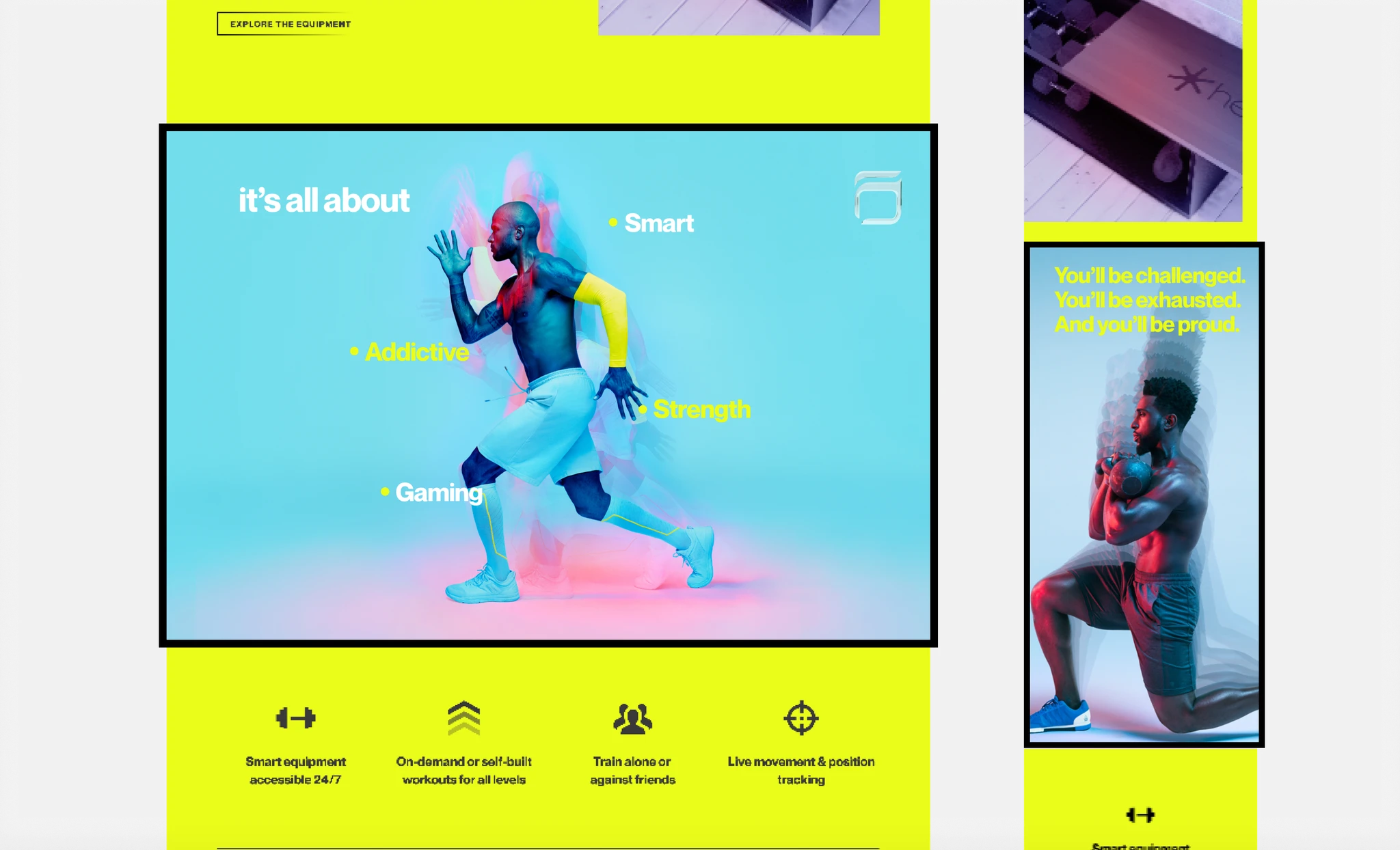
Every high-converting brand in the teardown led with a compelling story and a clear identity. Spec-led experiences created the weakest first impression.
Decision: How do we help first-time visitors immediately understand what Stædium is and who it's for?
Create a story-driven first impression that communicates the product's purpose, value, and audience before introducing features or specifications.
Impact →Captured attention quickly, built an emotional connection, and encouraged users to explore further.
02Understand
02 · Understand
Insight
Buyers needed enough information to understand a complex product without feeling overwhelmed by unnecessary detail.
Decision: How do we help users evaluate a high-consideration product with confidence?
Bring together everything users need to make an informed decision (clear product imagery, transparent bundle details, key benefits, pricing, and supporting information) while keeping the content easy to scan and explore.
Impact →Helped users understand the product, evaluate its value, and make informed purchase decisions with confidence.
03Trust
03 · Trust
Insight
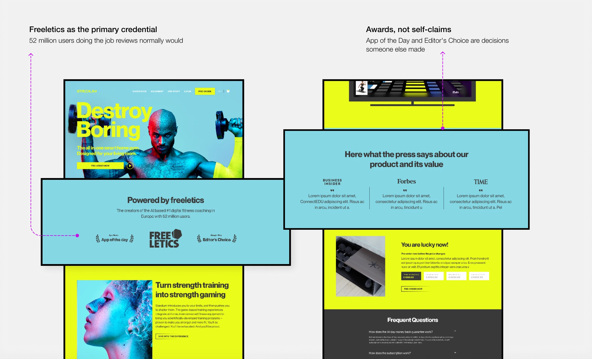
Credibility was most effective when embedded throughout the experience.
Decision: Where does credibility come from when nothing about the product can be independently verified?
Place brand credibility, third-party recognition, and press coverage at key moments where users naturally seek reassurance.
Impact →Credibility built at every step rather than argued for in one block.
04Pre-order
04 · Pre-order
Insight
Transparent pricing and clear expectations outperformed urgency-driven messaging.
Decision: How do we create urgency without it reading as pressure, on a product nobody can verify?
Communicate pricing changes, delivery timelines, and purchase terms openly, allowing users to commit with confidence.
Impact →Validated demand and reduced go-to-market risk before manufacturing.
05Emotion
05 · Emotion
Insight
Buyers connected more strongly with stories of transformation than with technical specifications.
Decision: How do we motivate users through emotional design?
An experience that used real user imagery, outcome-focused messaging, and clear progression cues to reinforce motivation, trust, and self-identification.
Impact →Increased authenticity and moved users from interest toward identification.
06Checkout without friction
06 · Checkout without friction
Insight
Every unnecessary step between intent and payment increased drop-off, while transparency and simplicity helped users complete their purchase.
Decision: How do we help users complete a high-value purchase with confidence?
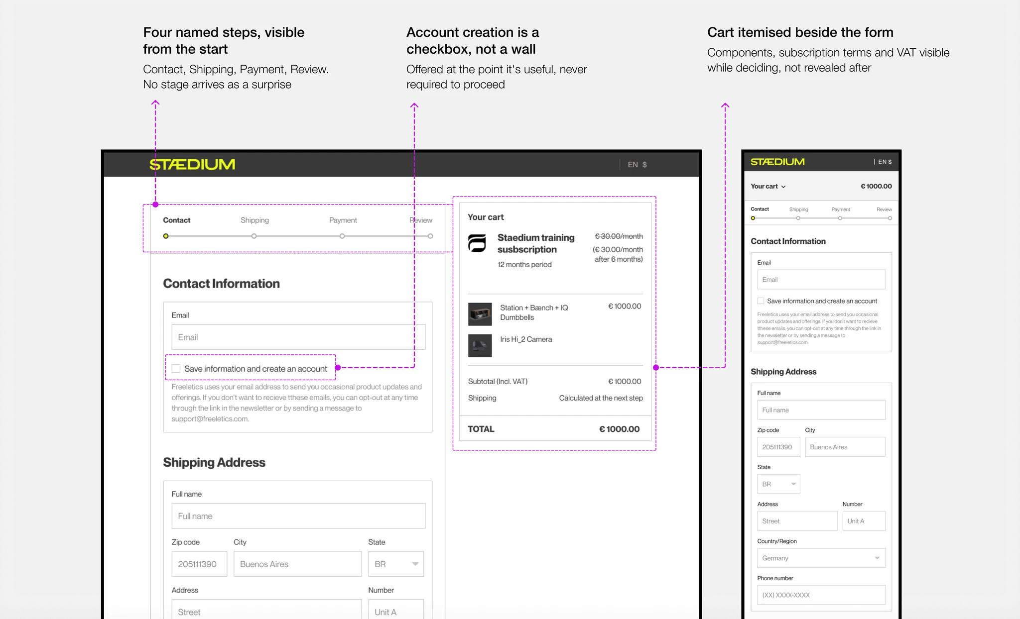
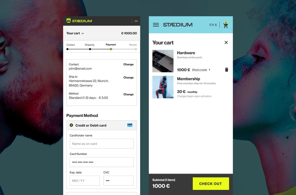
Design a distraction-free checkout that keeps pricing, delivery expectations, and order details visible while removing unnecessary steps between intent and payment.
Impact →Reduced last-minute hesitation and supported confident purchases.
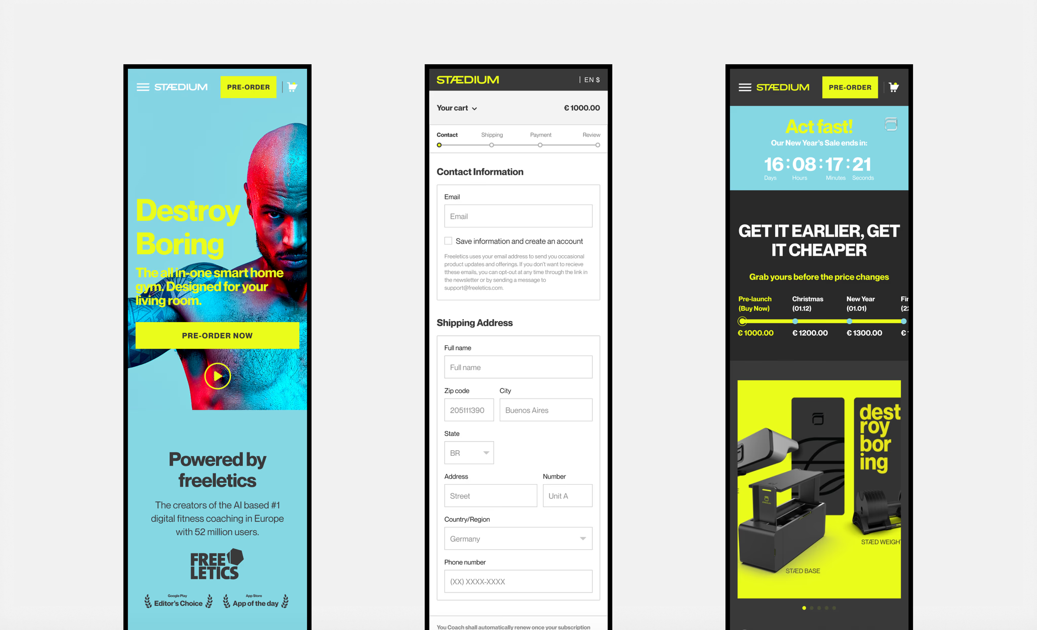
07Mobile first
07 · Mobile first
Insight
More than half of ecommerce traffic comes from mobile, making a consistent cross-device experience essential for conversion.
Decision: How do we deliver the same buying confidence across every screen size?
A seamless buying experience across devices, without compromising clarity or usability.
Impact →Seamless exploration and purchase across devices, with no drop in clarity on small screens.
Impact
A product nobody had seen sold out its pre-launch window
Building confidence for buyers
Unknown→Understood
Positioning and audience clear on the first screen, before any product detail.
Unverifiable→Trusted
Borrowed credibility replaced the reviews and hands-on experience that didn't exist.
Considering→Committed
500+ people paid for hardware they wouldn't receive for four months.
Business impact
€500K pre-launch revenue→ launch funded and de-risked before manufacturing
+70% conversion rate→ low bounce rates
500+ pre-orders→ users were willing to commit based on the digital experience alone
What does it mean?
GunaA buying decision is normally assembled from a showroom, a review, and someone who already owns one. None of those existed. All three had to be rebuilt on a screen, and 500 pre-orders measured whether the rebuild held.
Reflections from the journey
No research is a discipline, not an excuse
If you can't study your users, study the companies that already spent millions learning what your users respond to, and be explicit about what you're borrowing and what you're rejecting.
The commercial decision was to remove commercial options
Multi-bundle was the obvious AOV play and the wrong call. The same screen that lifts revenue on a mature product suppresses it on an unproven one, because the buyer's job at that moment is comprehension, not configuration.
Final thoughts
This was never really a shop. It was an argument that a product worth having existed, and the only way to test the argument was to ask people to pay before they could check. Every constraint (no proof, no data, no time) forced each decision to be reasoned rather than assumed. That's why I can still defend all of them four years later.
GSGuna Sekaran
Watch the product launch
Stædium launch keynote at Web SummitFreeletics · LinkedIn post
If you have more questions or want more detail, don't hesitate to get in touch. Meanwhile, take a look at my other work, my experiments, or learn more about me.
 Figma
 Miro
 Excel
 Jira
 Word